Sonja Trauss of SFBARF has argued that costs are high because there is not enough housing to go around and that the answer is to build more. Tim Redmond of 48 Hills has argued that building more housing would make the problem worse because the people who would move into it are likely to be wealthy newcomers whose demand for services will increase low-income employment, putting further pressure on older, lower-cost housing.
Who is right? Is anyone?
Housing cost trends over the years
To understand what causes high housing costs, we must first have an idea of how high costs are, and how high they have been over time.In the 1940s there were very few apartments advertised for rent. It is not clear whether this was because there were extreme shortages of housing lingering from World War II or whether people typically found their apartments some other way. Nevertheless, there is at least some rough evidence that prices were dropping every year until they briefly stabilized in 1954.
After this lull, in 1956, apartments began to be listed in increasing numbers, but their prices also began to rise. Overall, they went up 6.6% every year. Today's outrageous prices are exactly in line with the 6.6% trend that began 60 years ago.
There have, however, been a few deviations from this overall trend. In 1978, prices began to rise and did not return to the trend line until they stabilized for a few years in the early 1990s. Then in 1995 they rose sharply again, remaining above the trend line until 2005. Prices rose again in 2007 and dropped in 2009 before returning to the trend line.
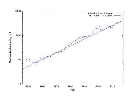
Nominal median rent by year
Note that the Y axis here is logarithmic, not linear, so the overall 6.6% trend is shown as a straight line, not as a steep curve.
It is slightly unfair to talk about this rent growth in face value dollars, because purchases in general, not just rent, cost more than they did in 1956 thanks to inflation. After adjusting for the Consumer Price Index, real rents have only gone up 2.5% per year and have only quadrupled in effective cost in 60 years. It is still an alarming increase.
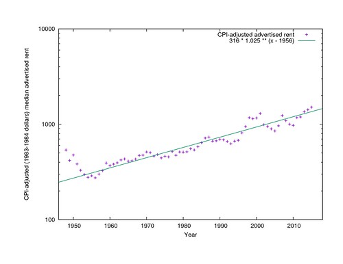
CPI-adjusted median rent by year
Sources of housing cost data
Where do these prices come from? Daniel Hertz at City Observatory warns us to be wary of anyone who says they know what the median rent in a city is, because their claims vary wildly.Nevertheless there are sources that appear to at least provide an internally-consistent view into the rise and occasional fall of rent over the years. A frequently cited source is the San Francisco Housing DataBook, which tabulates the median rent of two-bedroom apartments advertised in the San Francisco Chronicle on one Sunday per year, usually the first Sunday in April, from 1979 through 2001.
I set out to replicate the DataBook's methodology over a wider range of years, but quickly gave up on including just two-bedroom apartments, because ads in the early 1960s rarely referred to apartment sizes in these terms. Instead, for each first Sunday in April from 1948 through 1979, plus a few other years, I made a list of all the advertised unfurnished apartments, flats, houses, and, later, condos, regardless of size, that were advertised in the Chronicle. Mostly I used the San Francisco Public Library's page scans of the newspaper but resorted to microfilm for the few later years where no page scans are available.
In recent years, another good source is listings from Craigslist that have been preserved by archive.org. The dates that were archived vary considerably from year to year, so I collected all the available listings from each year, regardless of date.
The sources appear to be mutually comparable. There are three years (1979, 1984, and 2001) where I have all the Chronicle prices plus the DataBook two-bedroom figures. Fortunately in each of these years the same simple linear transformation of the DataBook two-bedroom price yields the median price that I found, so I have scaled the other DataBook prices the same way to bring them into my pool. (It would be better not to have to rely on the DataBook, but transcribing prices from microfilm is very tedious and time-consuming.) For the Chronicle and Craigslist, I have listings from both for 2003. The shapes of the distributions are the same and the two medians agree to within $100 (6%) so I have used the Craigslist medians without scaling for years since 2003.
Is median rent the right thing to compare?
Surprisingly, given the anxiety over "luxury" apartments vs regular, non-luxurious ones, there does not appear to be any segmentation in the rental market in any year, even by unit size. In every year with more than a handful of listings, the total pool of prices is a smooth curve (except for the occasional taboo price: landlords were strangely reluctant to offer apartments for exactly $105), approximately lognormally distributed. The 95th percentile apartment always rents for about 2.2 times the price of the median apartment, and the 5th percentile apartment for about 1/2.2 of the price of the median apartment, but see below about variability in this.Construction booms
What happened in 1954 to stop prices from dropping? The most obvious explanation is that that was when San Francisco ran out of large tracts of vacant land. It took a while before anyone noticed that anything was wrong, but by 1966 there was talk of a housing crisis, and the Planning Department began maintaining an annual report, the Housing Inventory, to keep track of the rate of housing construction and demolition. Recent issues of the Housing Inventory are online; older ones are in the Berkeley Environmental Design Library.
San Francisco's post-earthquake housing was built in a series of booms. The biggest were the immediate post-earthquake rebuilding from 1906 through 1918, when essentially all of the densest areas of the city were built, and then the transportation-led boom from 1919 through 1934, when the Marina, the Outer Richmond, West Portal, the Parkside, and the Outer Mission were built. From 1935 to 1943, the Central Sunset and Parkmerced filled in. From 1944 to 1954, the Outer Sunset and Ocean View were built. And that was essentially the end of the easily developed greenfield housing.
The next boom, from 1955 through 1967, still could fill in the hillsides of Twin Peaks and above O'Shaughnessy Boulevard. But the boom from 1968 through 1982 had no genuine vacant tracts to fill at all. It was the Redevelopment Agency's boom, rebuilding the Western Addition and the Golden Gateway and Diamond Heights. (The demolition of the Western Addition is subtracted from the net new unit count in earlier years.)
The first private infill boom was from 1983 to 1993. It was entirely on scattered sites, with no large tracts available. A long, double-peaked boom ran from 1994 through 2011, with a dip in the middle for the dot-com crash. It too was a scattered infill boom, aided by the South of Market sites made available by the former Embarcadero Freeway and I-280 extension. Since 2012 we have been in the ninth building boom, focused on sites on or near Market Street. Few sites are involved, but the numbers are the largest since the early 1960s because the buildings are large. I don't know how long it will continue.
(The Housing Inventory data only goes back to 1960, so information about earlier construction rates comes from the Planning Department's 2016 Land Use map. It tracks the year of construction of each building, not the year of first occupancy as the Housing Inventory does, and only of buildings that stil exist, but the numbers are generally comparable.)
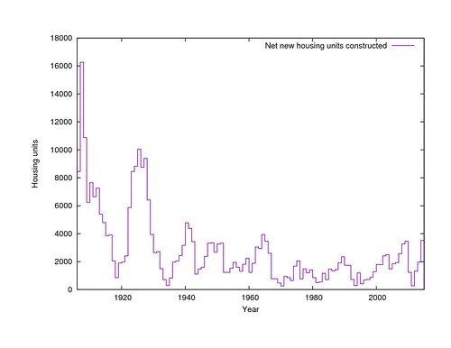
Net new housing construction per year
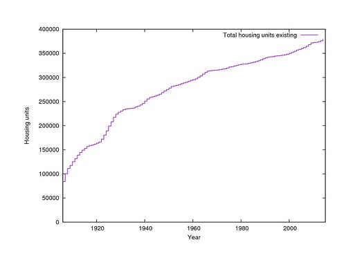
By summing the incremental construction (and destruction) each year, we get the cumulative housing inventory that existed in each year. What the starting point for the summation should be is somewhat mysterious, because the Census, and therefore the 2014 Housing Inventory, believes that 17,418 more units exist than the Land Use map knows about. Some of these may be illegally constructed in-law units; others may be hotel rooms that are not consistently counted as permanent housing. I have used the Housing Inventory count.
In any case, the quantity of housing stock alone does not provide an explanation for the median rent in any given year, because it has only increased since 1906, while prices have gone both up and down (but mostly up). It can only be understood as an adjustment to the other economic factors to be discussed below.
Cumulative housing existing at the end of each year
The economy
The Bureau of Labor Statistics has published reports for every year since 1975 giving the total wages paid by employers in San Francisco and the number of employees that those wages were paid to. Plotting the total wages paid in the city with the median rent in the city shows that these two trends are tied closely together. When the economy booms, rents go up, and when it collapses, they go down.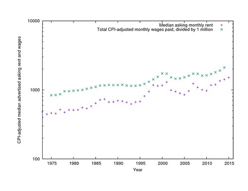
CPI-adjusted median rents and total wages paid per year
It should be noted that these economic trends are regional, and are essentially unaffected by politicians' attempts to attract business to city or suburbs. Compare, for example, the gross wages paid in Santa Clara County over the same period, which show an almost identical trend (with somewhat sharper peaks) since the late 1980s.
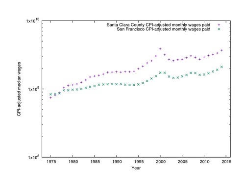
CPI-adjusted median rents and total wages in San Francisco and Santa Clara Counties
Total wages essentially represents the product of the number of people who need housing and their average ability to pay. You can get a pretty respectable fit to the median rents by finding independent exponents for the two terms. (I used Gnuplot's "fit" command to find the model parameters.) Housing, it appears, gets expensive either when people get paid more or there are more people getting paid, and more steeply than simple linear increase.
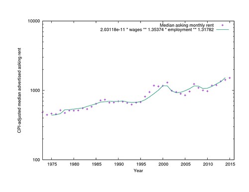
CPI-adjusted median rent and model from the product of employment and per-capita wages
Housing construction and rents
There are still several years where the model from employment data predicts higher or lower rents than were actually asked, though. This is where the housing inventory comes in. If you add it to the model, it does a better job of explaining the swings in rent over the past 20 years through the additional prediction that housing gets cheaper than employment alone would predict when you build more of it, and doesn't when you don't.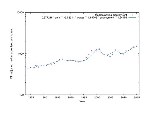
CPI-adjusted median rent and model from employment, wages, and housing inventory
The model still does not explain all the variations in rent. In particular, I have no explanation for why rents were high in 1998 and low in 2005. Something else important has changed over the years and I don't know what it was. Is it rent control? The Ellis Act? Costa-Hawkins? Restrictions on condo conversions? The invention of the TIC? Below-market-rate requirements? I haven't been able to find a direct relationship between any of these and asking rents, but that is not too surprising, since they are all coarse, does-it-exist-or-not step functions rather than things that vary smoothly over time.
It is important to note, too, that the model parameters are all approximate. They are determined empirically from the data, not from a theory, and even minor changes to the training data will shift them up or down, while leaving the general idea unchanged.
As an alternative, it is possible to model year-over-year change in rent in terms of year-over-year change in employment, wages, and housing construction. In this case the best fit says that a 1% increase in employment means a 0.95% increase in rent, a 1% increase in wages means a 1.74% increase in rent, and a 1% increase in the housing stock means a 1.7% decrease in rent. It's the same basic idea, but the magnitudes are different. I don't know if it is any more correct than the first model, or if they are both bouncing around within the same uncertainty.
Can we turn back the clock?
That said, if we accept the premise that lower salaries, lower employment, and higher housing construction mean lower rent, and that the model parameters are at least approximately correct, how much do any of these things need to change to make the city affordable again?Tim Redmond has pointed to his own arrival in 1981 as a time of comfortably low rent, even though it was preceded by a decade and a half of alarm over the cost of living, and rent control had just been instituted in an attempt to stop an even steeper rise in costs beyond the overall trend. Can we roll the clock back 35 years, to when the CPI-adjusted median rent was approximately one third what it is now?
It will be very hard. If the (first) model is correct, it would take a 53% increase in the housing supply (200,000 new units), or an 44% drop in CPI-adjusted salaries, or an 51% drop in employment, to cut prices by two thirds. A steep drop in salaries or employment would also be devastating to the ability of people to afford the new lower prices. It is enough to make you believe Randal O'Toole that affordability can only be achieved by continued outgrowth, as San Francisco could do in the early 1950s.
But does it even make sense to try to go back to 1981's prices? CPI-adjusted rent is three times as much today it was then, but CPI-adjusted average income has also doubled in that time. Maybe we should be trying for 1995 instead, when CPI-adjusted rent was half what it is now, not a third. But a 30% increase in the housing stock is not much easier to imagine. Whatever the goal ought to be, it is a long way away.
Income inequality
The other wrench in the works is the inequality of incomes. If you look for it, you can see a bimodal distribution of urban household incomes at least as far back as the 1960 census, and possibly earlier, but the two bands were about the same size and had considerable overlap. In the San Francisco residents of the 2000 census, the division is much sharper, essentially between the large (74% of households) higher-income group of salaried employees, and a small (26%) lower-income group of minimum wage workers. No matter how much the median rent can be lowered, it is still going to be very difficult for people in the lower-income group to afford housing.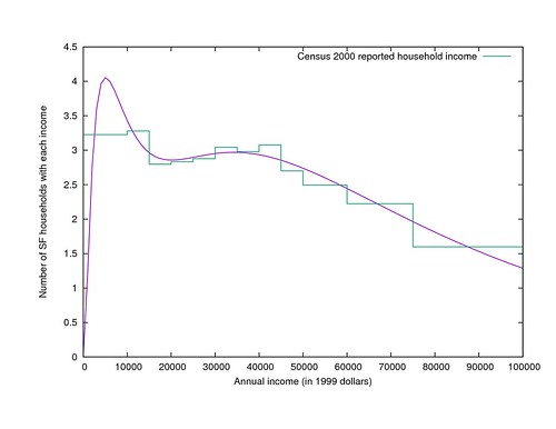
Distribution of household incomes in San Francisco in 1999
In contrast to the inequality of income is the equality of rents. I mentioned above that in nearly every year, the 95th percentile rent is about 2.2 times the median rent. But there is a small but noticeable effect on this distribution as new housing becomes available. The higher the housing production rate is, the closer both the highest and lowest asking prices get to the (new, slightly lowered) median price. (And then, apparently, when a construction boom ends, the rents flatten out a little more again.) This peakiness is an additional help for people who can pay something near the median, but pulls the distribution even further away from covering the full spectrum of incomes proportionately.
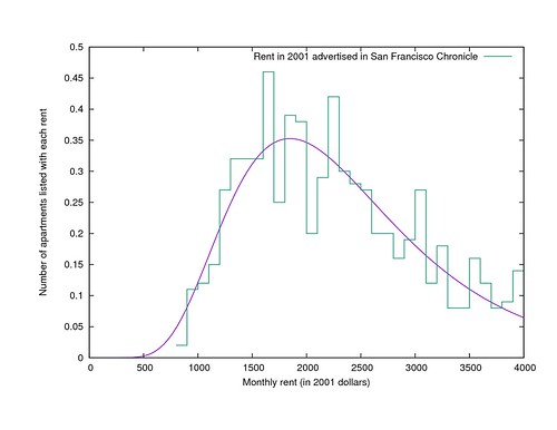
Distribution of advertised rents in San Francisco in 2001
It is a serious problem that the 5th percentile income is 10% of the median income while the 5th percentile rent is still 45% of the median rent, and it is a problem that housing construction alone can't solve.
In conclusion
San Francisco is an expensive city because it is an affluent city with a growing population and no easily available land for development. Sonja Trauss is right that building more housing would reduce rents of both high- and low-end apartments. Tim Redmond is right that building enough housing to make much of a dent in prices would change the visual character of most streets, although the result could be more like Barcelona than like the Hong Kong that he fears. The unsettled question is which of these is the higher priority.
Building enough housing to roll back prices to the "good old days" is probably not realistic, because the necessary construction rates were never achieved even when planning and zoning were considerably less restrictive than they are now. Building enough to compensate for the growing economy is a somewhat more realistic goal and would keep things from getting worse.
In the long run, San Francisco's CPI-adjusted average income is growing by 1.72% per year, and the number of employed people is growing by 0.326% per year, which together (if you believe the first model) will raise CPI-adjusted housing costs by 3.8% per year. Therefore, if price stability is the goal, the city and its citizens should try to increase the housing supply by an average of 1.5% per year (which is about 3.75 times the general rate since 1975, and with the current inventory would mean 5700 units per year). If visual stability is the goal instead, prices will probably continue to rise uncontrollably.
If you want to do your own analysis, the data is all available to download on Github. Please let me know what other explanations you find for the patterns!
really very good work, thanks
ReplyDeleteYour description of income inequality left me wishing for a graph of that double-banded distribution... or at least a link to where we could see one!
ReplyDeleteSeattle next please! Adding cities can validate those coefficients.
ReplyDeleteThis is great. Do you have R squares for the different runs of population, wage, and permit variables? How much did R square increase when you added permits to the population and wage model?
ReplyDeleteR²=0.926 with just employment data, 0.940 with construction records added.
DeleteCongrats for your results. A very good R2.
DeleteR squared isn't valid in time series models because of serial correlation. Time series regressions give a misleading overestimate of the fit. Here is a discussion.
Deletehttp://stats.stackexchange.com/questions/101546/what-is-the-problem-with-using-r-squared-in-time-series-models
I suspect Craigslist and perhaps traditional listing would under-count the substantial base of rent controlled housing: https://twitter.com/coryweinberg/status/630494350850437120 Would this effect the model?
ReplyDeleteI was expecting rent control to make a difference, but I just checked the ratios of census-reported rents to asking rents, and it's always just about a 3:2 ratio, with or without rent control, except in 1950 (no rent control) and 2000 (with rent control) when asking prices were higher. I don't know what was different in those years from the others, but it wasn't the presence or lack of rent control.
DeleteThe missing parameter and explanation to differences between 1998 and 2005 could be mortgage rates. Maybe owning was more affordable in 2005 then renting.
ReplyDeleteThat is a great point. 2005 I found renting my houses in Phoenix very difficult. In 2016 renters are lining up in droves for the same rentals.
DeleteIt looks like mortgage rates might affect the price a little in the 1980s but they doesn't seem to help the 1998-2005 discrepancy.
DeleteFantastic analysis. I am wondering if median household size has a significant impact on number of units required to keep rents/purchase prices stable? For example, the average household size was 3.33 persons in 1960, and 2.54 in 2015. I suspect in urban centers such as in SF the average is even lower with many more single people choosing to live alone and to delay marriage and building families. Additionally, it may be helpful to do an analysis on out migration and any correlation of price points. e.g. when price forces people to toss in the towel and move out of the city. I suspect that such out migrations, if added back into the total population, may indicate that we need even more housing units than your conclusion calls for. http://www.statista.com/statistics/183648/average-size-of-households-in-the-us/
ReplyDeleteThanks for the feedback, everyone! Cassidy Curtis, I added illustrations of the income and rent distributions above. I'll respond to the other comments as quickly as I can.
ReplyDeleteVery good analysis. I do think it leads to more questions about the current environment. The dense build New Urbanists advocates argue "induced demand" when the question is related to motor vehicles(lanes and parking) but don't see the effect of induced demand associated with new development. Currently only 8% of SF households can afford the majority of the new luxury units being constructed. The bias toward luxury construction induces high income residents and thus exacerbates the bimodal income divide in the city and creates economic hardship and displacement. The real question of what we want the city to be is not aesthetic. It sociologic. Who do we want the city to be for?
ReplyDeleteThe current building boom is being done by "big real estate and finance". It is a forced gold rush. Past booms have been more organic and better paced, except of course for the redevelopment disasters of the past. What we're now see is a "private funded redevelopment disaster". Socioeconomic studies should be done for every large project and mitigations should be required. Development must pay the full physical and sociological impact cost of development or just not be allowed.
There's a very good reason the concept of induced demand is generally only applied to transportation and not housing. Transportation demand is fungible: you can switch from transit to driving, or you can drive on a freeway during peak hours rather than waiting until after rush hour, or you can drive alone rather than car-pooling. All of these things are likely to happen once transportation capacity is expanded.
DeleteOn the other hand, most people, including even most very wealthy people, only live in one housing unit. When more housing is built, very few people consume more than one housing unit.
This is demonstrably false; in many cities (e.g. NYC and London) wealthy foreigners buy multiple housing units as safe places to stash money. They neither live in them nor rent them out.
DeleteHow many actual units fit this description? There might be what 10,000 of these units in New York? Out of millions of total units... it's a scale thing.
DeleteI am in awe of the data entry work here coupled with such seemingly fair-minded analysis. Nice work and thank you so much.
ReplyDeleteYour second to last paragraph says "the necessary construction rates were never achieved" to significantly halt the rise in prices. But "never" as used here doesn't seem to include anything before 1945, which I suspect is after zoning arrived. I don't know when minimum parking requirements arrived but it was probably at or before 1954, the starting year for the 6.6 percent climb you identify.
You say that SF's problem is that it ran out of "open" land, but the land wasn't "open" prior to 1945. It was privatized by that point, and had homes scattered around it. All 20th century development on the peninsula was infill, in some sense.
To be sure, rapidly transitioning from farm to city is a lot more familiar to us than transitioning from San Francisco to Barcelona. But it's not an essentially different process. It's just one that U.S. cities decided to illegalize early in the 20th century, before this analysis begins.
And as a piece of anecdata regarding how fast construction can happen, I have two photos for you, taken less than six years apart.
DeleteApril 1906: http://earthquake.usgs.gov/regional/nca/1906/kap/lawrence.php
February 1912: http://www.loc.gov/pictures/resource/pan.6a35716/
Zoom in and look around!
Yes, when a city that hasn't been fully built out has had large sections destroyed, it can rebuild quickly.
DeleteBut the building that happened from 1906 to 1912 has no relation to 2016 San Francisco.
When the next major earthquake happens here, hopefully there will be less destruction because of better building codes and fire prevention. But what does get destroyed will be rebuilt.
Why do you think it takes significantly longer to tear down a building and replace it than to clear away rubble and replace it?
DeleteTearing down is intentional so it is required to be done safely. But earthquakes do not care for our safety laws and do as they please.
DeleteAgain, 1906 earthquake destroyed a large section of San Francisco in days.
DeleteThe problem with too many in SFBARF is they'll post two photos from over 100 years ago and not seem to understand people live in buildings in San Francisco and they aren't going away, so buildings can be torn down in a some modern distopiam update of Fountainhead set in a San Francisco where SFBARF has seized control of city government.
In rare cases where that has happened like Trinity Plaza, it takes a really long time, first to protect the residents http://www.sfgate.com/bayarea/article/SAN-FRANCISCO-Deal-protects-tenants-of-Trinity-2627551.php and then to tear it down and replace it.
Michael:
ReplyDeleteYou are right that San Francisco had a zoning code in 1954, but its provisions were so lax that to current eyes it reads as essentially unregulated. The entire text of the Planning Code can fit on four pages (up from three pages in the original 1921 version). In the entire central city and on any transit corridor you could build any imaginable residential or commercial building, without any limits on lot coverage, density, or height, and most of the rest of the city was "second residential," with commercial uses restricted but any residential use still allowed.
Parking requirements were added at the end of 1957. A completely new zoning code, essentially today's code minus today's many amendments, came into effect in May, 1960, introducing comprehensive FAR, density, and specific use restrictions. Height limitations began in 1964.
What Portland was doing in the 1920s was still legal in San Francisco in the mid-1950s. It was just not being done very much because the city was expanding outward instead.
Ah, thanks, Eric. That's helpful.
ReplyDeleteIn any case, I would argue that the difference between (a) subdividing a small farm or estate and (b) transitioning from freestanding to attached or stacked housing is not quite as fundamental as a "we ran out of room and then we were doomed" narrative would suggest.
Also, sorry for misquoting "vacant" as "open" in my first comment. I was working from mobile.
ReplyDeleteBrilliant. And are you aware that just last week, the SF Assessor's Office released a treasure trove of open data? I'm planning to analyze it to see just how much of the city would have to change to add ~100k units (which if I'm reading your analysis right, would cut housing costs in half).
ReplyDeletehttps://www.reddit.com/r/opendata/comments/4j4szm/the_san_francisco_assessors_office_just_released/
Thanks Mike! I think that shapefile was actually the same one I used to calculate the pre-1960 construction rates, without realizing that it was brand new.
DeleteBTW, maybe I've made some kind of mathematical error, but it looks like we could increase the city's housing stock by 30% without turning it into Hong Kong *or* Barcelona: https://www.reddit.com/r/sanfrancisco/comments/4jh4q6/employment_construction_and_the_cost_of_san/d375mf5?context=1
ReplyDeleteThanks Mike. I think you've thought through that part of the process better than I have. What I was envisioning was the "one infill building per block" scenario, but repeated every year, and assuming you could only get two apartments per story instead of four.
DeleteHere's my attempt to digest into some policy lessons from this post, both for SF and elsewhere:
ReplyDeletehttps://medium.com/@andersem/a-guy-just-transcribed-30-years-of-for-rent-ads-heres-what-it-taught-us-about-sf-housing-prices-bd61fd0e4ef9
I had originally sent my CPI/Rent charts to Metcalf last fall and this seems to be a continuation of those thoughts. However, I think what is missing from your analysis is job growth, not just any job growth but high wage earner job growth. This is a new macro-economic trend in CA and is described in recent white papers by the Federal Reserve Bank of SF (it is also leading to SF/CA's very high 20+ poverty rate). It seems to me that the real issue are the two spikes, one in about 2000 and the other starting about 2011. What caused those spikes? As the Fed papers show it isn't just the job numbers causing the spike but rather it is the incomes of the people moving here and bidding up rents that is causing the rent spike (high wage earners). What we had was a 100 year flood of high wage earner job hires coming and bidding up the rental prices. Who could have planned for this? Metcalf suggests it was the NIMBY's but looking at previous year project pipelines and how many projects were held up---there would still not have been enough housing for this 100 year flood. And why blame NIMBY's? Why didn't the development industry see this trend coming? Regardless,there is more to the issue than that simple statement but also for you to conclude that building more market rate housing would help the city is not correct. I think from the data I have seen if there were some form of vacancy control so that middle-low income people were not forced into market rate housing and/or if new hires-ones with high salaries were required to live in market rate housing and not take out lower cost rent controlled housing, then rents in the city would be much lower on average (as a theoretical point). People would have been paying what they could afford. As the Fed report says, "a large number of highly paid employees can drive up housing prices." Also, as a planner I have seen a hundred different analysis that shows building market rate housing will not give us lower income housing. The NYT had such an article last year. Even the last Housing Element approved by the BOS last year shows that the city reached 97% of the needed market rage housing but only 16% of the middle income housing. Where in your analysis would that slippage occur? Check the Housing Elements of as many cities in CA and see how much market rate housing each city builds and how much lower income housing is built. That will answer your question as to whether market rate housing will do as you say. Market rate housing simply does not create low income housing. I wish SPUR would stop this building endless market rate housing campaign so we could focus on real ways to create a more housing-equitable city.
ReplyDeletePhilip, I think we agree that both the numbers of employees and the wages they are making are reflected in housing prices. What I am seeing in the numbers, though, is that, relative to what employment alone would predict, when there is more construction, the overall pool of available housing shifts downward in price. With high construction costs it is very hard to build "naturally affordable" housing that is affordable at the time of construction. But it appears that many people who have a choice do choose the new construction, making the units they formerly occupied available to people at lower price points. There is not a segmented housing market where some people are looking for "middle income housing" and other people are looking for "market rate housing." Everyone is drawing from the same pool.
DeleteEric, I don't agree with you on this. You state that wages are reflected in housing prices; actually, developers are going to continue to build high priced housing as long as there are people who will pay for it. That is a function of the high wage earners moving to SF and not due to overall housing demand. The fact that more market rate housing is built is not going to impact the demand at the lower income levels. The trickle down effect doesn't work because all that housing will be taken up by people who can afford it higher (remember too that the high wage earner industries are forcing out businesses that pay middle and lower income rates-so these people move and and the new high wage earners move in-and they are able to meet the bid of almost any price. Something a teach could not do. While high construction costs make building affordable housing more expensive, most affordable housing is built by non-profits or government entities that subsidize the price. So, I am not sure where you are going with the naturally affordable housing issue-but if the market rate developers can't meet our city need in that respect then maybe we should wait for the non-profit affordable housing developers to catch up and build the lower end.As I mention above, one can look at Housing Elements from almost any city in the state. Each revised element contains data from the preceding 7 years. In every city I have been involved with the market rate segments are being met but the middle-, low-, and very-low income segments are not being met. In cases where the middle and low income housing needs are being met it is only when non-profits, redevelopment agencies, etc step in and help finance it. That need is never met by market rate overflow. Spur is wrong about pushing for a Market-Rate Build-A-Thon. It simply does help to meet our cities housing needs.
DeleteThere is evidence from New Zealand that shows surprisingly the most affordable place to buy a place is the Auckland downtown. This is because most new apartments are being built there to high density.
DeleteSingle family home suburbs are more unaffordable, despite them being full of established buildings.
Apartments and housing affordability http://transportblog.co.nz/2016/05/15/apartments-and-housing-affordability-2/
There is also simulation model evidence from Sonja Trauss's SF model that adding more market rate housing helps everyone get more housing at all income levels precisely through the 'moving chains' mechanism that Eric Fisher suggests.
Delete"How does adding expensive housing help the little guy?"
"A central question of our housing debate is whether building new (expensive) housing protects existing low-cost housing, or destroys it."
http://sfbarf.tumblr.com/post/123336484965/how-does-adding-expensive-housing-help-the-little
Eric is missing eviction data. The notion that by building higher priced market rate housing does not move middle and lower income people to lower level housing simple isn't true in SF.
Delete"...every fancy new roof holds prices down a little bit because the rich people under it don’t push middle-class people out from under their middle-quality roofs, and so on down the line until someone ends up in a tent.”
That is not true-at least not in SF.
The average techie can easily pay for an apartment that current tenants who are teachers, government workers, nurses or baristas can’t afford. This is driving evictions way up.
Landlords of existing properties and developers of new housing will charge as much as they can. With so many people around making six-figure salaries, they can charge a lot. Average rents in San Francisco are out of reach for most, but not for the average techie. People with high salaries can pay an even bigger chunk of their pay for housing and still have plenty left over, thus the intense competition for housing, which keeps all prices skyrocketing.
The fact that more market rate housing is built is not going to impact the demand at the lower income levels. The trickle down effect doesn’t work because all that housing will be taken up by people who can afford it higher.
Instead of the build more market rate housing mantra the city needs to 1) stop evictions , and, 2) build more affordable housing. At least half of all new housing should be affordable.
The high wage earner job growth has caused the loss of middle and low income jobs. High wage earners then move into their old units at new and much higher prices. There is nowhere for the former renters to move to because of the lack of affordable housing alternatives. So, the lower income groups are pushed lower.
This macro-economic effect of high wage earner job growth and the impacts of that trend has started to be followed by the Federal Reserve Board of SF. It is something the city needs to study, especially before we all drink the build more market rate housing Kool-aid.
http://www.frbsf.org/economic-research/publications/economic-letter/2013/april/job-economic-growth-california/
Hmm. Comparing the Rent Board eviction data with the construction data shows that there tend to be fewer evictions in years with higher construction (about 2000 evictions per year with no construction, about 1650 per year with 3500 new units per year). This seems to argue against your premise that construction is encouraging eviction.
DeleteI'm with Eric (and so are the facts and the theory). Build tons of market rate housing and prices/rents will fall. And zone to allow SRO's and other alternative units like that too will help.
DeleteLet's make this simple. Suppose you have two kinds of people, high-earners and low-earners. Now suppose you have two kinds of apartments, affordable and market-rate. High-earners always prefer market-rate apartments. Assume that the rent for the apartments is determined by supply and demand.
DeleteIn the first state of the world, let's say there are enough affordable apartments and market-rate apartments for everyone.
Then, in the second state, let's introduce a lot of high-earners into the system. In this state, high-earners compete for the market-rate apartments, driving up those rents, but there aren't enough market-rate apartments for everyone to live in, so some high-earners are forced to compete for affordable apartments. Since they need somewhere to live and can afford to do so, they out-bid the low-earners for the affordable apartments and rents rise on the affordable apartments as well, leaving nowhere for the low-earners to live.
In the third state of the world, we build enough market-rate apartments for all of the high-earners to live in. Now only low-earners are competing for the affordable apartments. Since there is less competition for these and only the low-earners are bidding on them, the rent for affordable housing decreases to what the low-earners can afford to pay.
What it seems to me you are suggesting, Philip Millenbah, is that this will not happen, and you never explain why it won't happen. Landlords can't charge more just because they want to. If no one is able or willing to pay that amount, then the rent prices must fall. I don't see another explanation.
Who is operating the affordable apartments under Jared's model? It's not some form of government mandated fixed-price system, because that would presumably exclude people over a certain income renting the apartments.
DeleteIf the people operating the affordable apartments can charge any price they like, then if there is demand from high-earners, they will quickly choose a price that isn't affordable.
Interesting analysis. A possible answer to this: "why rents were high in 1998 and low in 2005. Something else important has changed over the years and I don't know what it was."
ReplyDeleteThe housing crash of 2008 provided evidence that it's not just how rich people are that determines their economic behavior -- it's how rich they *feel* they are. I would suspect that the periods when rents seemed to go up faster than income would suggest they should have would be related to that factor. Perhaps people felt richer than they actually were because their perceived wealth was inflated by a (faulty) perception of how much dot-com equity would be worth to them, for instance.
1998-2005 corresponds to the run-up in Internet speculation followed by the crash after 9/11.
ReplyDeletehttp://www.salon.com/1999/10/28/internet_2/
Great analysis! I'm amazed you took the time to look up, and record the data from scans and microfiche.
ReplyDeleteThanks for putting this out, is nice to see an unbiased look at the question, based on real data.
Fantastic. Would you expect a suburb of SF to follow similarly? I mean, of course rents are cheaper in dollars in, say, oakland or South San Francisco, but I feel like you'd have the same economic pressures pushing rents up and down at the same times so should we expect a similar 6.6% region-wide? If you wanted to try to validate your tentative conclusion about rent control, you could do the same analysis for berkeley which has experienced similar economic pressures while having had strict rent control on the books for several decades.
ReplyDeleteOki
The big trends are regional, not specific to San Francisco, but I don't have the data on construction rates in other Bay Area cities to compare. The employment data is also by county or metro area, not by city, which makes it harder to do for cities that don't happen to conveniently be a unified city-county like San Francisco is.
DeleteHi, Any ideas about the lack of interaction with population drop off between 1950 and 1975 - I was just looking at this today (wrt to housing costs!). https://www.wolframalpha.com/input/?i=population+of+san+Francisco+1850+to+2016
ReplyDeleteIt is indeed strange that housing demand can grow as population shrinks. The thing that was happening to balance it is that households were also getting smaller (from a median of 2.3 residents/unit in 1950 to 1.9 in 1970), so there was more housing unit demand per capita.
DeleteVery interesting work! How does the model predict prices for 1970 and earlier? Those years are omitted from the plot.
ReplyDeleteI wish I knew, but the employment data is only available since 1975, so I don't know. That's why it doesn't appear in the plot.
DeleteLooking at the peak of 1998, could it possibly be an influx of entrepreneurs who are not salaried but need housing? All these people pitching their decks around need a place to sleep but are not accounted in city data. Maybe look at number of pitch decks received per year?
ReplyDeleteRegarding on/off factors such as laws getting into effects etc. it might be useful to look at government as a constant function where over a long period of time its cumulative actions or expected actions are one more factor in the market. Its median effect is already built into the yearly raise you calculated. NIMBYism among the constituents is also probably a constant, what may provoke some changes are when some regulations are imposed on the city from outside factors which are of a non-NIMBYstic nature which the local government cannot counterbalance.
Nice work.
ReplyDeleteThough I didn't understand the equation/formula. Everything is just multiplied by each other? What about the bits that have ** between them, what does that mean?
Is it possible to have a sample calculation for a given year? I just didn't get my head around it. What does it predict next year's rents could be?
Sorry to be confusing. The ** is exponentiation, often written as ^ instead, or in standard math notation as a superscript like 2⁵.
DeleteI have no prediction for next year's rent without knowing how many units are being built now that will be available then, and how many people will be making how much money. The prediction is just for how much the rent will change based on how much these other things change.
This comment has been removed by the author.
ReplyDeleteI have a question regarding the final model. Do you have any suggestions as to why total wages goes from an extremely tiny positive effect (2.03E-11) to a very large negative effect (-2.5) when you add the number of units to the model?
ReplyDeleteI should have added some parentheses to make the math clearer. The 2.03e-11 is the overall multiplier. The parameter weights are the exponents, which *follow* the name of the parameter, not precede it. So the weight of per-capita wages goes from 1.35374 to 1.89709 between the two, which I hope seems more reasonable.
DeleteAll of a sudden everything makes a whole lot more sense, thank you for clarifying. Great job, by the way.
DeleteThank you for putting in so much effort.
ReplyDeleteOh my goodness. Thank you.
ReplyDelete#Datahero. Thanks for putting this together!
ReplyDelete#Datahero. Wish I had this in my city.
ReplyDeletehttps://medium.com/@andersem/a-guy-just-transcribed-30-years-of-for-rent-ads-heres-what-it-taught-us-about-sf-housing-prices-bd61fd0e4ef9#.sjo6o3iyx
Wonderful analysis. I'm glad you too the time to look into this. No easy answers but at least the debate can begin.
ReplyDeleteNice analysis. This would make an interesting piece for our award-winning journal focused on planning practice, Focus. Please consider submitting it at: http://digitalcommons.calpoly.edu/focus/
ReplyDeleteEric,
ReplyDeleteThank you for this work. You've done some great research here. It would be interesting to see if similar trends could be repeated in other metropolitan areas, such as in my home here in Seattle, where we are also seeing a rapid rise in housing costs.
One thing that caught my eye as a traffic engineer and a transportation planner was strange drop in prices prior to 1960, leading up to 1956. That date sticks in my head because of the Federal Aide Highway Act of 1956 which started the construction of the Interstate Highway System. This began the trend of people moving outward, and being able to travel further for work, moving peoples homes further from the city centers. I have lately been putting a lot of thought into this trend as we're seeing more and more people give up their cars and move back to the city in favor of walkable environments and transit. I wonder if that will cause a similar but opposite trend (i.e. an increase) as was experienced in the early 1950's.
Thanks for the good work!
I would love to see if the same effects happen in other places.
DeleteIt wouldn't surprise me if there is a back-to-the-city effect, especially since the most expensive central cities are also the ones with the highest pedestrian volumes, but I don't know how to quantify it.
I first started looking at rents in an attempt to figure out whether the legendary cheap rent that drew the hippies to the Haight-Ashbury could be attributed to anxiety over the planned Panhandle Freeway through the neighborhood. I wasn't able to find enough listings with locations that could be connected to the freeway route to make any conclusions, though. In the Bay Area, it's hard to link suburban expansion directly to the Interstate system, since most of the core routes were built as state and US highways, with Interstate routes and route designations only coming a decade or two later.
This is very interesting. I think the conventional wisdom has been that San Francisco's housing price escalation began in the mid-1970's, but you've documented it back for another 20 years.
ReplyDeleteTo me the question about whether high end housing filters lower rents/prices all the way to the bottom is still unanswered. The question is how many new household formations happen in between. The ultra-rich buying up 2nd/3rd/8th units is a phenomenon, though I don't think anybody's documented its scale. But new households would also get formed within San Francisco. If rent increases abated, people who are involuntarily doubling and tripling up could move into their own units. People living in the Bay Area but outside the city could move in (which might soften rents elsewhere) and get a second unit for occasional use, which wouldn't help housing at all. I'm not aware that anybody's really tried to study filtration for decades--the finding then was that units which came on the market at a lower price point did more for filtration that those that came in at the very top.
I think the nearly-unchanging shape and width of the distribution of prices is the proof that filtering exists. If the overall rental market increases in size, and the median price shifts downward, and the shape of the distribution stays the same, then availability at the low end must have increased. You're right that shrinking households could eat away some of the newly created supply, but household size has been shrinking gradually for decades so this isn't a new phenomenon.
DeleteIt seems logical that introducing new units at low prices would help more than introducing them at high prices, but this seems hypothetical until someone figures out a way to reduce construction costs.
Hello Eric:
ReplyDeleteI am attempting to replicate the regression with the data provided on the git hub account. My coefficients are not the same is in the graphs, so was wondering if you transformed the data.
The Gnuplot script to make the graphs is https://github.com/ericfischer/housing-inventory/blob/master/model if that will clarify anything. The transformations that I did were to scale prices by CPI, to calculate per-capita wages from total wages and total employment, and to do the fitting in log space rather than linear.
DeleteThanks. It looks like the data provided on total wages is scaled by CPI in the regression formula
ReplyDeleteIn the regression:
+log10(total_wages/CPI)
A working public transit system is a must in this kinda insanely expensive metropolitan area. I hope they're thinking hard how to improve it.
ReplyDeleteEric,
ReplyDeleteWhy are you using a multiplicative (log) model instead of an additive one?
It looks like the economic variable model and the economic+housing models yield nearly equally good fits. Doesn't this then show that the housing prices are independent of housing supply?
Could you post a graph of fit residuals, to highlight the late 1990s bump?
Multiplicative seems like the right thing because it seems logically to represent the number of people who need housing times the amount they have to spend divided by the apartments they could spend it on. I don't see how additive would make sense.
DeleteThe model does work reasonably well with just economic factors, so I could be wrong about supply mattering, or maybe it is just because supply has not changed a whole lot over the time period in question. The results are better with supply than without, though.
if it's not tech startups then all we need is a big earthquake
ReplyDeleteRents did not drop in response to the 1989 earthquake.
DeleteHi Eric,
ReplyDeleteSince you used a multiplicative model, I assume that you you took the natural log of both the dependent and independent variables. I am writing a post about this on my blog and, before publish it, I want to get the same results as you. Thus far, taking the log and log 10 in every combination possible does not give the same estimates as you report in your graphs. I am think of taking the log of the response variable so that exponetiating the coefficients has a straight forward interpretation. Doing this, however, makes two of the estimates non-significant.
Yes, I was fitting the log of the CPI-adjusted rent to the log of the output of the multiplications:
Deletefit log(f(units, per_capita_wages, employment)) "combined" using 3:($6 / $7 / $5):5:(log($2 / $7)) via m, units_e, pcw_e, employment_e
The curve fitting converges to a set of estimated parameters, rather than having a uniquely defined solution, so it's not surprising that you are getting something at least a little different than I got. I'll be interested to see the alternate explanation that comes from your model.
Sounds good. I am going to use the data and analysis that is on you git hub as a point of reference, although it is different than what you are describing. Nonetheless, I think my overall point will still be interesting even if the data is not exactly the same as yours.
DeleteA rare piece of dispassionate fact based analysis in the breathless debate on Housing Prices.
ReplyDeleteRent control creates a significantly higher financial risk for landlords. This risk gets reflected in new rents for vacated units. Rental property owners subject to rent control tend to price their vacant units more aggressively and keep those units vacant until the higher rent prices are achieved. Did you see anything in the data you reviewed that might help measure the effect of rent control on new rents?
ReplyDeleteI looked at census-reported rents vs. asking rents in the years that are available from the census, and rent control doesn't seem to have changed things very much. In most years, asking rent is about 1.5 times reported rent, except in 1950 and 2000 when it was higher. There was rent control in 2000 but not in 1950 so it looks like long term tenancy in general has more of an effect in keeping reported rents below the market rate than rent control specifically does.
DeleteThis comment has been removed by the author.
ReplyDeleteI highly respect the amount of work you did gathering this data.
ReplyDeleteHowever, you did not adequately prove that adding housing supply to the model is significant, and your policy conclusions depend on that.
Simply increasing the R2 value is not sufficient proof that the term is significant. You need a significant log likelihood test or an AIC difference of more than 2-3 points to establish that housing supply is a significant factor in the model.
Can you publish the results of a log-likelihood test and an AIC comparison of the two models?
DeleteI am working on a post addressing this very issue. The model with the lowest AIC simply has wage as a predictor. I am making a post, but will be using waic as I will be using Bayesian modeling.
DeleteI'll be looking forward to reading your post, Donald Williams. Joe Hill, I wish I were good enough at statistics to provide the proof that you are looking for, but I am not.
DeleteI'm busy today, but perhaps tonight I will try duplicating your result in R and checking the AIC and doing a log-likelihood test if applicable. (Since you are using a smoothing model, I'm not sure if the log-likelihood test is applicable strictly speaking. I will consult my favorite R stats reference.)
DeleteI'm finally taking the time to check this out, and am working on a blog post with my results. I'll post it soon, hopefully later tonight.
DeleteMy real name is Matt Tyler (not Joe Hill), and here is the blog post I wrote re-analyzing this data:
Deletehttp://moreuseful.blogspot.com/2016/05/another-look-at-factors-driving-rents.html
Using a well established methodology, I reach the conclusion that housing inventory is not a significant predictor of median rents in this San Francisco data set.
Thanks for putting so much work into doing this reanalysis, Matt! And it's still somewhat encouraging that at least no one has found that increased supply increases the median price, so new construction still might benefit people at the low end of the rent range by increasing the overall supply at every price.
DeleteI wonder if there is any data that would help predict what strategies would be the most successful at creating the most dedicated affordable housing, as you suggest San Francisco should be doing.
Thanks. You raise a good question. I honestly don't know.
DeletePart of me was kind of hoping that the problem of affordability for people at the low end could be solved by simply increasing inventory, but my analysis suggests that it might not be effective. I guess all I can say is that in Minneapolis, where I grew up, there were and still are many apartment complexes owned and operated by non-profit affordable housing developers with the stated goal of providing affordable housing, and that state policy - at least at one time - was geared towards helping these developers with lower property tax rates, etc. So, I suppose that anything policy makers can do to incentivise or remove barriers for non-profit housing developers might be good. But that's way above my pay grade.
All of that said, as another poster has pointed out, none of us have actually proven causation - we've only proven correlation. I'm wondering if you've given any thought to that.
I was wrong. Using the data on the GIT HUB, the "Best" model is log(rent) ~ log(housing) + log(wages). However, the coefficients are different than what you have. My post is pretty much done, but I am going to do some more editing before I make it public. If it means anything Eric, I was very skeptical of the model at first but it stood up well to scrutiny :)
ReplyDeleteThanks for checking! I know the coefficients are pretty uncertain so I'll be interested to see what you found them to be.
DeleteDonald - where can I find your post?
DeleteHere!
Deletehttp://brycewayne0329.wix.com/hormones-n-stuff#!Multiple-Regression-Multicollinearity-and-Model-selectionoh-my/c1mbt/574255a30cf23218abf9633c
Hi: I am still working on it. I did a lot of work, through which I used model selection with lm in R. Since I was using log's, I thought this work work, particularly because the analysis on git hub used glm with a gaussian distribution. I have never done work with time series. Through reading the literature, I realized that I was not doing something right in that there is significant autocorrlation. I will still finish the post using model selection, but I do not think it is necessarily right. I will then do a follow up with a correctly specified model
ReplyDeleteNote that to get the same parameters as Eric you'll need to use non-linear regression, rather than linear regression in log space.
DeleteHere is what I have to go off: pricemodel2<-glm(real84_median_rent~log10(housing_units)+log10(employment)+log10(total_wages/CPI),data=SFok,na.action=na.exclude,family=gaussian(log))
ReplyDeleteThis is what is on GitHub and it does not produce the same estimates that Eric got.
I was curious about what happened before the beginning of your analysis. WW2 ending must have distorted the 50’s. I found a real estate ad in the wall of my house from 1929. A house was listed for $4500 in 1929 (a few weeks BEFORE the great depression), and the same house is now pending sale for $949,000. Annualized that comes to about 6.35% compounded appreciation, remarkably close to your 6.6%.
ReplyDeleteFor reference an online CPI caluculator tells me that the house would cost only $62,963! (http://www.usinflationcalculator.com/)
It's only 1 data point, but an interesting measure of how long housing has been inflated dramatically more than general inflation. And a strange argument against the idea I hear regularly that some major crash is going to dramatically bring prices into some rational balance with wages. Frankly it doesn’t make sense to me, and It hasn’t made sense for a long long time.
This is the real estate ad:
https://flic.kr/s/aHskAPe4kM
I wish I knew how what the price trends were in earlier years. I stopped entering the rent data with 1948 because there were no apartments being advertised for rent by price in early 1947, only ads placed by individual people hoping to find housing! The housing shortages associated with World War II must have been terrible, and it looks like it took several more years for availability to return at all.
DeleteI read somewhere that in 1945-1946, SF was flooded by returning soldiers, and every house, apartment and hotel room was occupied. It would be very interesting to see if and how this affected housing prices. This crunch was quickly deflated, as people moved to new suburbs or elsewhere.
DeleteAmazing work, Eric. What's the license on your data set? May I recommend using one of these? http://opendatacommons.org/licenses/
ReplyDeleteIt probably ought to be CC0/Public domain as a collection of facts. I'm not sure how to properly reconcile that with ultimately deriving from copyrighted newspapers.
DeleteHi Eric,
ReplyDeleteI finished my post. Let me say that my post is more about statistics than housing in SF. As such, I make no that my analysis is right. I am a scientist(a graduate student) and, as you probably know, there is a current crisis in reproducing results. As such, I used this as a post to show how different results can come from the same data. I also stayed faithful to the glm formula on your github, which I noticed was not yours. I will follow this post with another post, however, modelling this data with a residual correlation structure that is meant for time series. Enjoy !
http://brycewayne0329.wix.com/hormones-n-stuff#!Multiple-Regression-Multicollinearity-and-Model-selectionoh-my/c1mbt/574255a30cf23218abf9633c
http://brycewayne0329.wix.com/hormones-n-stuff#!Multiple-Regression-Multicollinearity-and-Model-selectionoh-my/c1mbt/574255a30cf23218abf9633c
Thanks for putting so much work into reanalyzing this! I have certainly struggled too with trying to figure out which of several plausible models is the best, and which parameters do the best even within a single form.
DeleteIs your position that employment growth and housing growth have essentially balanced each other out into irrelevance? Or am I reading too much into what you write?
Here is the blog post re-analyzing this that I promised:
Deletehttp://moreuseful.blogspot.com/2016/05/another-look-at-factors-driving-rents.html
I find that there is NOT statistically significant evidence that housing inventory effects median rents from these data.
Give it a look.
Note to Don: I examined time series auto-correlation in my post, so you might find that helpful.
DeleteI got waylaid from statistical analysis by looking for qualitative patterns in the data. First, here's the nominal median rent vs. the average income in your data:
ReplyDeletehttp://imgur.com/lERtBuf
And here is the same data, adjusted by CPI:
http://imgur.com/N3wSvAz
The patterns I see are:
1. Rent and wages roughly unchanging in constant dollars until the mid-1990s.
2. Rapid increase in both during the dotcom era and the current tech boom.
3. Rapid decrease in both during the dotcom bust and the recession.
3. Rents changing little during 1998-2000 and declining a bit during 2002-2005, even as wages were rising in both periods. Is that really true? The first, especially, seems odd. I recall prices rising rapidly then right up to the crash.
4. The rate of change of rents vs. wage is roughly constant post-1995, about $1.6 in rent per $1 of wages. This rate is apparent both in the rises and the declines, though not during the stagnant periods noted above. This ratio is odd. Typically rent amounts to about a third of personal income, and you'd expect the rate of change to be at about this ratio as well. I suspect a better model may explain this by accounting for non-wage income, and by specifically estimating the income of housing seekers, separate from that of homeowners and rent-controled tenants.
Rather than look at the amount of construction, I estimate supply using population density (persons/unit), using population data from FRED and unit counts as given here. The historical density is plotted here:
http://imgur.com/lERtBuf
Higher density has gone hand in hand with higher average wages in recent years, which makes it hard to distinguish their relative significance without quantitative modeling. However, San Francisco in the mid-1980s experienced population density comparable to the present one, but without a comparable rise in rents. This suggests that housing prices are driven more by demand (high incomes) than supply (housing shortage).
My somewhat more rigorous statistical analysis of Eric's data tends to agree that high incomes are driving median rent increases rather than housing inventory, but employment also appears to be driving rents.
DeleteThat said, I've been wondering about population density, so I thank you for producing this chart. Can you post the Fed's population data somewhere?
I've been wondering about this question from a reverse angle - that is, developing a metric of housing saturation. That is, given mean household size in SF (if it has been measured independent ly), what percent of housing units would be occupied at that rate given the current poulation. Such a measure might be an indicator of physical housing scarcity.
It's here:
Deletehttps://research.stlouisfed.org/fred2/series/CASANF0POP
They have tons of other economic data as well, some of which is very relevant to this line of work.
Another useful metric is the (rental) vacancy rate, but I haven't yet found a good source for it going back to 1975.
DeleteYes, the rental vancancy rate would be quite helpful. That's sort of what I was proposing to calculate indirectly.
DeleteAnd thanks for Federal Reserve link . :-)
DeleteThis comment has been removed by the author.
ReplyDeleteEric,
ReplyDeleteI strongly sympathize with the need for more housing in the Bay Area, but when you write "...it would take a 53% increase in the housing supply... or a 44% drop in... salaries, or a 51% drop in employment, to cut prices by two thirds" you are mistaking correlation for causation. No doubt building enough new homes would reduce housing prices, and a sufficient reduction in wages and/or employment would lower housing prices as well, but that cannot be inferred from the model. The model's coefficients are not valid estimates of these events' causal effects.
If you want to read up on things, have a look at section 9.2 of Stock & Watson's Introduction to Econometrics. You may also want to read up on "spurious regression" and non-stationary time series, but that is a much more complicated affair.
Good point.
DeleteI was thinking about the question of correlation vs. Causation today, and am wondering if path analysis, which can be used in some circumstances to establish causation, could be used with this data set.
Any thoughts on this?
Well, I'm not sure that path analysis alone is the solution. The real problem is that there isn't that much data to use - only about 70 time-series observations - and any correlations you might find could well be explained by mere time effects: perhaps variation in certain cultural trends cause, say, both total employment and rents to fluctuate, rendering spurious any correlation you find between total employment and rent.
DeleteWhat might work would be to match San Francisco to a set of comparable cities (either geographically, e.g. San Jose, Oakland, Berkeley) and/or culturally (Boston, Seattle, Austin) and then find an exogenous shock that affects San Francisco but not the matched cities. For example, perhaps a surprise court ruling declared that San Francisco city employees - but not city employees of the matched cities - were owed backpay to be disbursed immediately (hence increasing total wages in San Francisco but not the matched cities). One might then conduct a difference-in-difference analysis comparing the resulting increase in rent in San Francisco vs. the matched cities.
But the upshot is that rather than worrying about the particular modeling strategy - path analysis, regression, ANOVA, etc. - I think it much more important to carefully consider where you plausibly be able to determine causality and estimate the causal parameters. Maximizing R-squared alone does not achieve that goal.
I have a few questions.
ReplyDelete1. Why ignore the population? Clearly new housing units can’t be expected to do much if they simply increase in proportion to population. Why not adjust for that (i.e. new housing per new person)?
2. Why not include household income, or the share of income spend on rent? After all, one suspects that the primary diver of rents is the ability of one household to outbid the other for a location.
3. Isn’t the distribution of household locations important? Building more homes on the fringe will reduce median and average rents simply because there are more homes in inferior locations. You said as much about this relationship historically.
4. Does allowing more dense buildings actually provide additional incentive to bring forward new housing construction? Or is it a freebie to landowner who will sit on their development option, just as many thousands of landowners currently sit on their option to develop.
To make my point clear, the % increase in homes was greater than the % increase in population from 2000 to 2010. I assume that was the case in the pre-1979 data as well. http://www.bayareacensus.ca.gov/counties/SanFranciscoCounty.htm
And if you take into account the transport costs of living in different locations, the rents aren’t as bad as they seem in many areas. See this link for a housing and transport cost index http://htaindex.cnt.org
Home building at 3x the normal rate would soak up resources from elsewhere, meaning it is not clearly obvious this is a good thing. For example, I am familiar with the Australian data where 6% of GDP is on housing building. Could we really spend 18% of GDP on it instead, over a period of decades?
Anyway here are some of my previous writings on this topic
http://www.fresheconomicthinking.com/2016/05/time-to-throw-out-standard-urban.html
http://www.fresheconomicthinking.com/2015/09/how-to-analyse-housing-markets.html
http://www.fresheconomicthinking.com/2015/09/doing-housing-supply-maths.html
Really interesting, and thanks for putting so much effort into this analysis. But one nit that could affect your conclusions: it looks like you are using the Bay Area all-items CPI to adjust rents for inflation. But that CPI includes housing prices (weighted as about 1/3 of the CPI calculation), so you need to adjust for that when calculating the real increase in rents.
ReplyDeleteInterest rates and accessibility to financing should be a large component of your model and might explain some of the odd variations. When people can more easily find and afford condos or houses, they are less likely to rent. In 2005, financing was still very easy (e.g. sub prime) and non-rental housing was constructed on a large scale. A better proxy than interest rates might actually be new home/condo sales. More of those should ease demand on rentals. The downside, already reflected in your data, is a slowdown in rental unit development. Finally, isn't autocorrelation a problem? In your model, if your variables aren't truly independent, you're going to get weird results.
ReplyDeleteI wasn't able to find a form where interest rates made a difference in the rents in the year that the rate applied. But it makes sense that interest rates would affect construction rates, and it is true that the years with the lowest interest rates also tended to have the most applications for building permits (although with plenty of variation), so low interest rates at one point means more housing available a few years later.
DeleteDo you have a good source for number of new home sales over time?
Actually I'm wrong: the years with the highest interest rates *do* have the lowest CPI-adjusted rents. So you're right that that should probably be in there.
DeleteThis comment has been removed by a blog administrator.
ReplyDeleteit's always interesting getting different people's spin on the sf cost of housing and suggestions on how to deal with it. your data analysis and models are definitely useful in explaining historic trends and future directions and deserve much respect.
ReplyDeletei've often wondered if something could be done in our definition and design of a 'living unit' that could more rapidly ease the pressures at the lower end.
more specifically, how might we house more people using less resources?
there are a number of homes that have turned into dormitories... with 10+ people occupying a single home. cramming people into traditional units is not the answer... but some aspect of what they're doing may be.
the most congested living spaces most of us experienced would probably be the dormitories we stayed in at school. it seems like some combination of private/shared space could offer an additional, low-cost, alternative housing option... if they existed. x number of private bedroom spaces that shared a common living/kitchen/bath, if designed well, would be much better quality of life than these flop houses offer.
at the very least, they would provide an entry point into living in the city for the less affluent... and as horrible as it is with people having to leave, the greater lack of diversity may be with who can now enter... and who knows what the long term effect of that may be.
something like many of the residential hotels seen in the tenderloin or quads at colleges. construction costs should be much less with with the shared components and could be built much quicker than the same number of individual units.
this would mostly benefit individuals who do not have the benefit of combined income of a couple or the options that may offer in the market. even though this wouldn't work well with families, it seems the majority of government assisted traditional housing units are directed toward families but not individuals. and the idea of this type of housing wouldn't be meant to solve all needs... just to open a portal that's been closed and relieve a little of the overall housing pressure.
anyway... just a thought.
This comment has been removed by a blog administrator.
ReplyDeleteThis comment has been removed by a blog administrator.
ReplyDeleteThis comment has been removed by the author.
ReplyDeleteThis comment has been removed by a blog administrator.
ReplyDeleteWhile I appreciate the work conducted in this posting, I'm afraid that everything after the 'Can We Turn Back the Clock' subheading is flawed because it imbues the shown purely *predictive* regressions with a strong *causal* interpretation that is unwarranted given the extant evidence. As we all know, correlation is not causation: just because a particular independent variable *predicts* the dependent variable does not mean that it *causes* the dependent variable.
ReplyDeleteIndeed, reverse-causality seems to be a highly plausible counter-explanation for at least some of the predictive relationships shown here. Perhaps increases in rent are actually causing increases in total employment and wages by driving more people to take jobs and work longer hours (so that, natch, they can afford the higher rent). Alternatively, perhaps a third variable such as changing cultural tastes are driving one or more of the independent variables as well as the dependent variable. For example, perhaps the rise of second-wave feminism is driving both greater total employment/wages (as more women enter the workforce) and also higher rents (as newly empowered women demand nicer places to live).
To properly estimate the true causal effect of any of the proposed independent variables upon rents would likely require an instrumental variable: some other variable that is correlated with an independent variable but that is not itself correlated with the dependent variable except through the independent variable in question. For example, perhaps a surprise labor law court case ruling found that many San Francisco residents were owed additional pay that is to be paid out immediately. That might perhaps comprise the skeleton of an instrumental variable for total wages. Similarly, perhaps certain property law court rulings surprisingly found that many apartment buildings are unfit for habitation and therefore condemned and therefore removed from the housing market. That might plausibly comprise the skeleton of an instrumental variable for housing units.
But without this type of rigorous analysis, all we have is a set of purely predictive regressions with no clear *causal* interpretation
This comment has been removed by the author.
ReplyDeleteThis comment has been removed by a blog administrator.
ReplyDeleteThis comment has been removed by a blog administrator.
ReplyDeleteThis comment has been removed by a blog administrator.
ReplyDeleteThis comment has been removed by a blog administrator.
ReplyDeletenice
ReplyDeleteThis comment has been removed by a blog administrator.
ReplyDeleteThis comment has been removed by a blog administrator.
ReplyDeleteThis comment has been removed by a blog administrator.
ReplyDeleteThis comment has been removed by a blog administrator.
ReplyDeleteThis comment has been removed by a blog administrator.
ReplyDeleteThis comment has been removed by a blog administrator.
ReplyDeleteThis comment has been removed by a blog administrator.
ReplyDeleteThis comment has been removed by a blog administrator.
ReplyDeleteThis comment has been removed by a blog administrator.
ReplyDeleteThis comment has been removed by a blog administrator.
ReplyDeleteThis comment has been removed by a blog administrator.
ReplyDeleteThis comment has been removed by a blog administrator.
ReplyDeleteThis comment has been removed by a blog administrator.
ReplyDeleteThis comment has been removed by a blog administrator.
ReplyDeleteThis comment has been removed by a blog administrator.
ReplyDeleteThis comment has been removed by a blog administrator.
ReplyDeleteThis comment has been removed by a blog administrator.
ReplyDeleteThis comment has been removed by a blog administrator.
ReplyDeleteThis comment has been removed by a blog administrator.
ReplyDelete[I've disabled additional comments, since all the recent comments are spam.]
ReplyDelete