Sonja Trauss of SFBARF has argued that costs are high because there is not enough housing to go around and that the answer is to build more. Tim Redmond of 48 Hills has argued that building more housing would make the problem worse because the people who would move into it are likely to be wealthy newcomers whose demand for services will increase low-income employment, putting further pressure on older, lower-cost housing.
Who is right? Is anyone?
Housing cost trends over the years
To understand what causes high housing costs, we must first have an idea of how high costs are, and how high they have been over time.In the 1940s there were very few apartments advertised for rent. It is not clear whether this was because there were extreme shortages of housing lingering from World War II or whether people typically found their apartments some other way. Nevertheless, there is at least some rough evidence that prices were dropping every year until they briefly stabilized in 1954.
After this lull, in 1956, apartments began to be listed in increasing numbers, but their prices also began to rise. Overall, they went up 6.6% every year. Today's outrageous prices are exactly in line with the 6.6% trend that began 60 years ago.
There have, however, been a few deviations from this overall trend. In 1978, prices began to rise and did not return to the trend line until they stabilized for a few years in the early 1990s. Then in 1995 they rose sharply again, remaining above the trend line until 2005. Prices rose again in 2007 and dropped in 2009 before returning to the trend line.
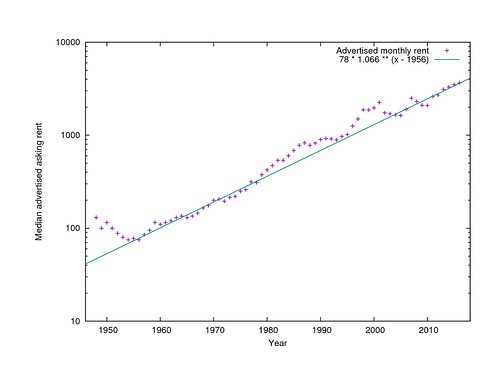
Nominal median rent by year
Note that the Y axis here is logarithmic, not linear, so the overall 6.6% trend is shown as a straight line, not as a steep curve.
It is slightly unfair to talk about this rent growth in face value dollars, because purchases in general, not just rent, cost more than they did in 1956 thanks to inflation. After adjusting for the Consumer Price Index, real rents have only gone up 2.5% per year and have only quadrupled in effective cost in 60 years. It is still an alarming increase.
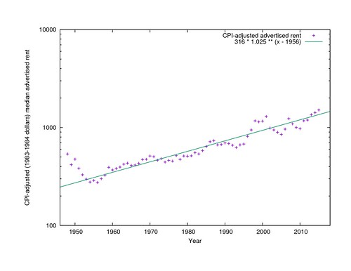
CPI-adjusted median rent by year
Sources of housing cost data
Where do these prices come from? Daniel Hertz at City Observatory warns us to be wary of anyone who says they know what the median rent in a city is, because their claims vary wildly.Nevertheless there are sources that appear to at least provide an internally-consistent view into the rise and occasional fall of rent over the years. A frequently cited source is the San Francisco Housing DataBook, which tabulates the median rent of two-bedroom apartments advertised in the San Francisco Chronicle on one Sunday per year, usually the first Sunday in April, from 1979 through 2001.
I set out to replicate the DataBook's methodology over a wider range of years, but quickly gave up on including just two-bedroom apartments, because ads in the early 1960s rarely referred to apartment sizes in these terms. Instead, for each first Sunday in April from 1948 through 1979, plus a few other years, I made a list of all the advertised unfurnished apartments, flats, houses, and, later, condos, regardless of size, that were advertised in the Chronicle. Mostly I used the San Francisco Public Library's page scans of the newspaper but resorted to microfilm for the few later years where no page scans are available.
In recent years, another good source is listings from Craigslist that have been preserved by archive.org. The dates that were archived vary considerably from year to year, so I collected all the available listings from each year, regardless of date.
The sources appear to be mutually comparable. There are three years (1979, 1984, and 2001) where I have all the Chronicle prices plus the DataBook two-bedroom figures. Fortunately in each of these years the same simple linear transformation of the DataBook two-bedroom price yields the median price that I found, so I have scaled the other DataBook prices the same way to bring them into my pool. (It would be better not to have to rely on the DataBook, but transcribing prices from microfilm is very tedious and time-consuming.) For the Chronicle and Craigslist, I have listings from both for 2003. The shapes of the distributions are the same and the two medians agree to within $100 (6%) so I have used the Craigslist medians without scaling for years since 2003.
Is median rent the right thing to compare?
Surprisingly, given the anxiety over "luxury" apartments vs regular, non-luxurious ones, there does not appear to be any segmentation in the rental market in any year, even by unit size. In every year with more than a handful of listings, the total pool of prices is a smooth curve (except for the occasional taboo price: landlords were strangely reluctant to offer apartments for exactly $105), approximately lognormally distributed. The 95th percentile apartment always rents for about 2.2 times the price of the median apartment, and the 5th percentile apartment for about 1/2.2 of the price of the median apartment, but see below about variability in this.Construction booms
What happened in 1954 to stop prices from dropping? The most obvious explanation is that that was when San Francisco ran out of large tracts of vacant land. It took a while before anyone noticed that anything was wrong, but by 1966 there was talk of a housing crisis, and the Planning Department began maintaining an annual report, the Housing Inventory, to keep track of the rate of housing construction and demolition. Recent issues of the Housing Inventory are online; older ones are in the Berkeley Environmental Design Library.
San Francisco's post-earthquake housing was built in a series of booms. The biggest were the immediate post-earthquake rebuilding from 1906 through 1918, when essentially all of the densest areas of the city were built, and then the transportation-led boom from 1919 through 1934, when the Marina, the Outer Richmond, West Portal, the Parkside, and the Outer Mission were built. From 1935 to 1943, the Central Sunset and Parkmerced filled in. From 1944 to 1954, the Outer Sunset and Ocean View were built. And that was essentially the end of the easily developed greenfield housing.
The next boom, from 1955 through 1967, still could fill in the hillsides of Twin Peaks and above O'Shaughnessy Boulevard. But the boom from 1968 through 1982 had no genuine vacant tracts to fill at all. It was the Redevelopment Agency's boom, rebuilding the Western Addition and the Golden Gateway and Diamond Heights. (The demolition of the Western Addition is subtracted from the net new unit count in earlier years.)
The first private infill boom was from 1983 to 1993. It was entirely on scattered sites, with no large tracts available. A long, double-peaked boom ran from 1994 through 2011, with a dip in the middle for the dot-com crash. It too was a scattered infill boom, aided by the South of Market sites made available by the former Embarcadero Freeway and I-280 extension. Since 2012 we have been in the ninth building boom, focused on sites on or near Market Street. Few sites are involved, but the numbers are the largest since the early 1960s because the buildings are large. I don't know how long it will continue.
(The Housing Inventory data only goes back to 1960, so information about earlier construction rates comes from the Planning Department's 2016 Land Use map. It tracks the year of construction of each building, not the year of first occupancy as the Housing Inventory does, and only of buildings that stil exist, but the numbers are generally comparable.)
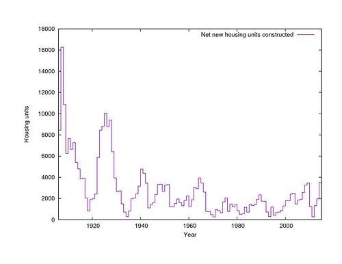
Net new housing construction per year
By summing the incremental construction (and destruction) each year, we get the cumulative housing inventory that existed in each year. What the starting point for the summation should be is somewhat mysterious, because the Census, and therefore the 2014 Housing Inventory, believes that 17,418 more units exist than the Land Use map knows about. Some of these may be illegally constructed in-law units; others may be hotel rooms that are not consistently counted as permanent housing. I have used the Housing Inventory count.
In any case, the quantity of housing stock alone does not provide an explanation for the median rent in any given year, because it has only increased since 1906, while prices have gone both up and down (but mostly up). It can only be understood as an adjustment to the other economic factors to be discussed below.
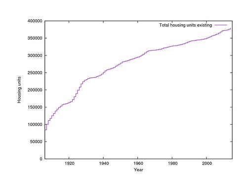
Cumulative housing existing at the end of each year
The economy
The Bureau of Labor Statistics has published reports for every year since 1975 giving the total wages paid by employers in San Francisco and the number of employees that those wages were paid to. Plotting the total wages paid in the city with the median rent in the city shows that these two trends are tied closely together. When the economy booms, rents go up, and when it collapses, they go down.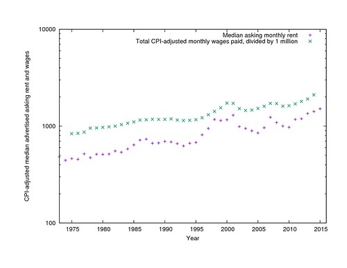
CPI-adjusted median rents and total wages paid per year
It should be noted that these economic trends are regional, and are essentially unaffected by politicians' attempts to attract business to city or suburbs. Compare, for example, the gross wages paid in Santa Clara County over the same period, which show an almost identical trend (with somewhat sharper peaks) since the late 1980s.
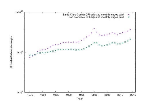
CPI-adjusted median rents and total wages in San Francisco and Santa Clara Counties
Total wages essentially represents the product of the number of people who need housing and their average ability to pay. You can get a pretty respectable fit to the median rents by finding independent exponents for the two terms. (I used Gnuplot's "fit" command to find the model parameters.) Housing, it appears, gets expensive either when people get paid more or there are more people getting paid, and more steeply than simple linear increase.
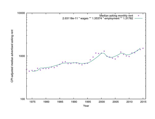
CPI-adjusted median rent and model from the product of employment and per-capita wages
Housing construction and rents
There are still several years where the model from employment data predicts higher or lower rents than were actually asked, though. This is where the housing inventory comes in. If you add it to the model, it does a better job of explaining the swings in rent over the past 20 years through the additional prediction that housing gets cheaper than employment alone would predict when you build more of it, and doesn't when you don't.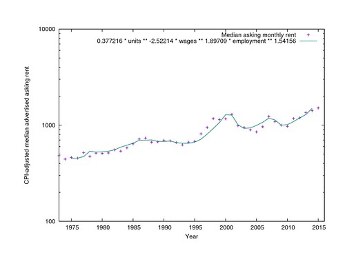
CPI-adjusted median rent and model from employment, wages, and housing inventory
The model still does not explain all the variations in rent. In particular, I have no explanation for why rents were high in 1998 and low in 2005. Something else important has changed over the years and I don't know what it was. Is it rent control? The Ellis Act? Costa-Hawkins? Restrictions on condo conversions? The invention of the TIC? Below-market-rate requirements? I haven't been able to find a direct relationship between any of these and asking rents, but that is not too surprising, since they are all coarse, does-it-exist-or-not step functions rather than things that vary smoothly over time.
It is important to note, too, that the model parameters are all approximate. They are determined empirically from the data, not from a theory, and even minor changes to the training data will shift them up or down, while leaving the general idea unchanged.
As an alternative, it is possible to model year-over-year change in rent in terms of year-over-year change in employment, wages, and housing construction. In this case the best fit says that a 1% increase in employment means a 0.95% increase in rent, a 1% increase in wages means a 1.74% increase in rent, and a 1% increase in the housing stock means a 1.7% decrease in rent. It's the same basic idea, but the magnitudes are different. I don't know if it is any more correct than the first model, or if they are both bouncing around within the same uncertainty.
Can we turn back the clock?
That said, if we accept the premise that lower salaries, lower employment, and higher housing construction mean lower rent, and that the model parameters are at least approximately correct, how much do any of these things need to change to make the city affordable again?Tim Redmond has pointed to his own arrival in 1981 as a time of comfortably low rent, even though it was preceded by a decade and a half of alarm over the cost of living, and rent control had just been instituted in an attempt to stop an even steeper rise in costs beyond the overall trend. Can we roll the clock back 35 years, to when the CPI-adjusted median rent was approximately one third what it is now?
It will be very hard. If the (first) model is correct, it would take a 53% increase in the housing supply (200,000 new units), or an 44% drop in CPI-adjusted salaries, or an 51% drop in employment, to cut prices by two thirds. A steep drop in salaries or employment would also be devastating to the ability of people to afford the new lower prices. It is enough to make you believe Randal O'Toole that affordability can only be achieved by continued outgrowth, as San Francisco could do in the early 1950s.
But does it even make sense to try to go back to 1981's prices? CPI-adjusted rent is three times as much today it was then, but CPI-adjusted average income has also doubled in that time. Maybe we should be trying for 1995 instead, when CPI-adjusted rent was half what it is now, not a third. But a 30% increase in the housing stock is not much easier to imagine. Whatever the goal ought to be, it is a long way away.
Income inequality
The other wrench in the works is the inequality of incomes. If you look for it, you can see a bimodal distribution of urban household incomes at least as far back as the 1960 census, and possibly earlier, but the two bands were about the same size and had considerable overlap. In the San Francisco residents of the 2000 census, the division is much sharper, essentially between the large (74% of households) higher-income group of salaried employees, and a small (26%) lower-income group of minimum wage workers. No matter how much the median rent can be lowered, it is still going to be very difficult for people in the lower-income group to afford housing.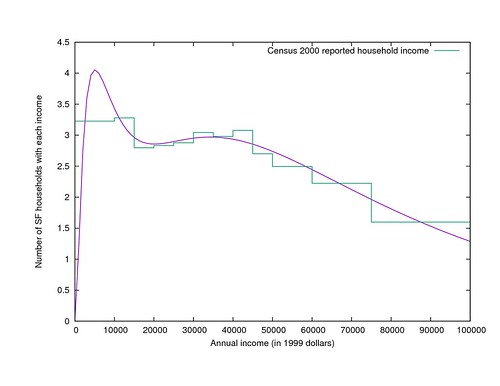
Distribution of household incomes in San Francisco in 1999
In contrast to the inequality of income is the equality of rents. I mentioned above that in nearly every year, the 95th percentile rent is about 2.2 times the median rent. But there is a small but noticeable effect on this distribution as new housing becomes available. The higher the housing production rate is, the closer both the highest and lowest asking prices get to the (new, slightly lowered) median price. (And then, apparently, when a construction boom ends, the rents flatten out a little more again.) This peakiness is an additional help for people who can pay something near the median, but pulls the distribution even further away from covering the full spectrum of incomes proportionately.
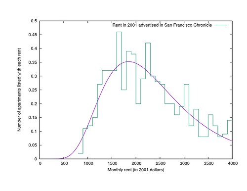
Distribution of advertised rents in San Francisco in 2001
It is a serious problem that the 5th percentile income is 10% of the median income while the 5th percentile rent is still 45% of the median rent, and it is a problem that housing construction alone can't solve.
In conclusion
San Francisco is an expensive city because it is an affluent city with a growing population and no easily available land for development. Sonja Trauss is right that building more housing would reduce rents of both high- and low-end apartments. Tim Redmond is right that building enough housing to make much of a dent in prices would change the visual character of most streets, although the result could be more like Barcelona than like the Hong Kong that he fears. The unsettled question is which of these is the higher priority.
Building enough housing to roll back prices to the "good old days" is probably not realistic, because the necessary construction rates were never achieved even when planning and zoning were considerably less restrictive than they are now. Building enough to compensate for the growing economy is a somewhat more realistic goal and would keep things from getting worse.
In the long run, San Francisco's CPI-adjusted average income is growing by 1.72% per year, and the number of employed people is growing by 0.326% per year, which together (if you believe the first model) will raise CPI-adjusted housing costs by 3.8% per year. Therefore, if price stability is the goal, the city and its citizens should try to increase the housing supply by an average of 1.5% per year (which is about 3.75 times the general rate since 1975, and with the current inventory would mean 5700 units per year). If visual stability is the goal instead, prices will probably continue to rise uncontrollably.
If you want to do your own analysis, the data is all available to download on Github. Please let me know what other explanations you find for the patterns!